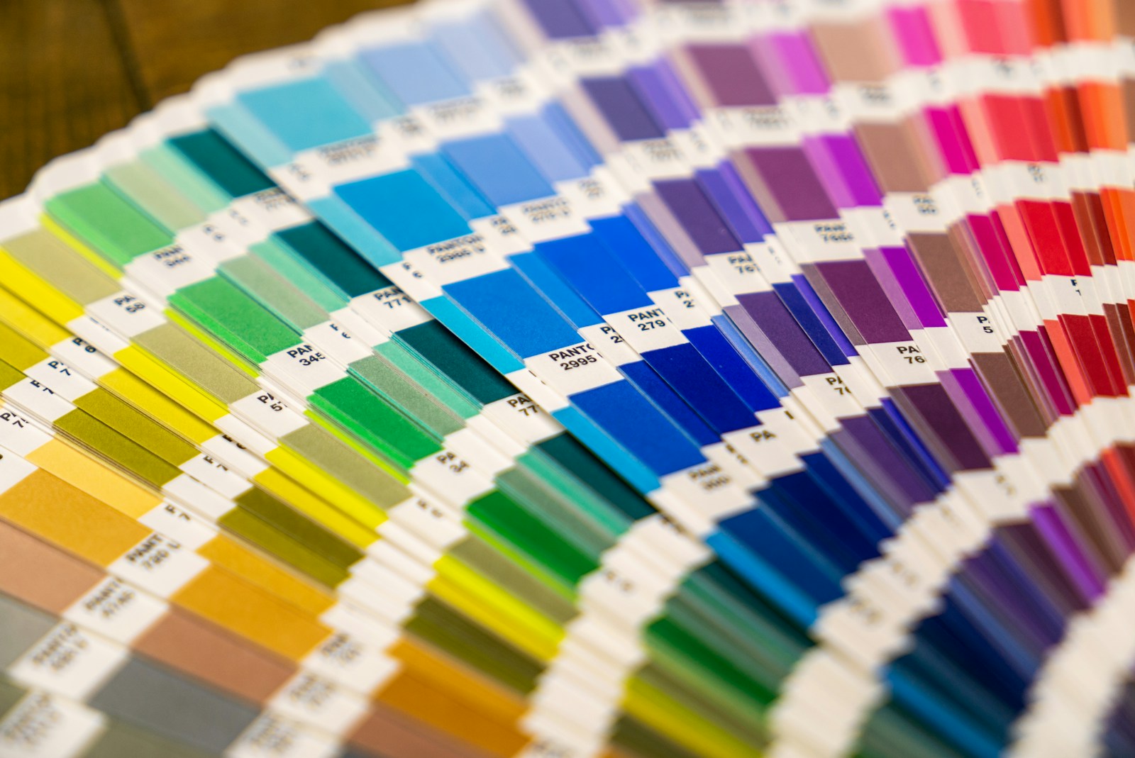
Even experienced designers sometimes make mistakes when choosing colours. Poor colour choices can make a design look unprofessional and difficult to read. Understanding common colour matching mistakes can help improve the overall quality of a design.
One common mistake is using too many colours. When a design includes too many different colours, it can feel chaotic and overwhelming. Limiting the design to a small palette helps keep everything visually balanced.
Another mistake is low contrast between text and background. For example, light grey text on a white background can be very difficult to read. Designers should always make sure there is enough contrast so users can easily read the content.
Many beginners also choose colours that clash with each other. Bright colours that do not complement each other can make a design look unpleasant. Using a colour wheel can help designers find combinations that work well together.
Finally, ignoring accessibility is another common problem. Some colour combinations may be difficult for people with visual impairments or colour blindness. Designers should test their colours to ensure everyone can comfortably view the content.
Avoiding these mistakes can help create designs that are cleaner, more professional, and easier to use.

Leave a Reply